A Flag for Free Software and Monnaie Libre

Leaving politics out as much as I can: in the US, there are people protesting and assembling on various issues (both local and federal). What there is no shortage of at such assemblies is flags representing different causes and ideas.

For example, a yellow flag with a rattlesnake on it or a flag with a gun on it. Or something as specific and custom printed in the context of the elections.

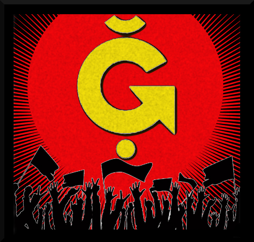
So I think as something as long term as free software and monnaie libre deserves a flag. What are your opinions on designing and creating flags for either the free software or monnaie libre movements?

1 « J'aime »

Good idea! It would be very nice to have a flag and sell a bunch of them on ğ1 marketplaces. It will be easier to meet in public places. What are the things we want to appear on this flag? Maybe one of the ğ1 logos? Axiom team has published a lot on its page: https://axiom-team.fr/supports

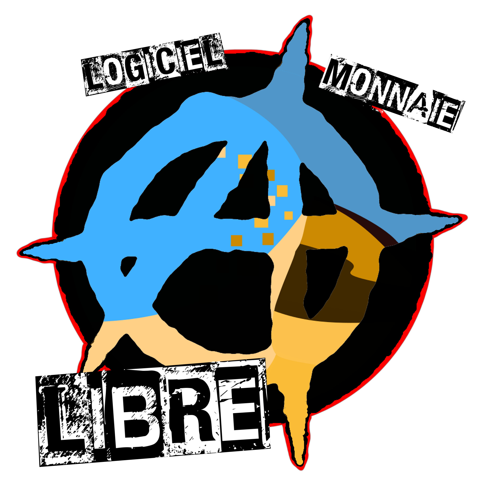
These are the ones I would like to see (even they are not consensual)

Maybe see this thread

1 « J'aime »

I made this to represent my ideology:

  • Red/black: equality and freedom (anarcho-communism, or libertaire)
  • Star: revolution
  • Green star: esperanto, interoperability, peace, culture…
  • ∀ (inverted A):
    • means « for each » in formal logic, represents cryptoanarchy
    • looks like a gnu’s head
  • ~ (tilde): alternative (like in electrical notation), it means we have to build something new
  • ˘ (breve):
    • libre currency, relativity
    • looks like the star is smiling, represents utilitarianism (optimize happiness)

It’s a public domain SVG so everyone can remove, modify or add elements to this flag, following their ideology.

5 « J'aime »

image
Remains the least commonplace around here, and the least political.

Why is there a dot at the bottom of this one?

Wanting libre currency or free software is political. This symbol is the more precise, because it represents only libre currency.

The dot is for the 1 in Ğ1. Maybe the Ğ2 was intended to have two dots…

1 « J'aime »

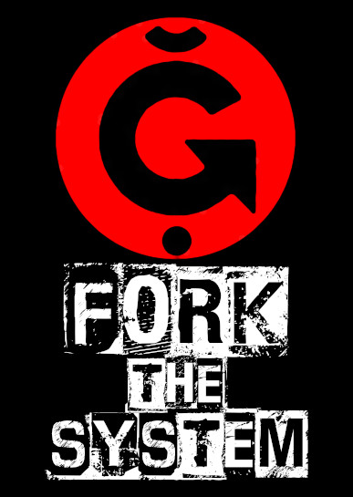
I saw other flag concepts for free software. I think the most common issue with flag designs is trying to cram in too much meaning into a single flag. If it doesn’t lose simplicity, it generally gets mangled by other concepts and so on. One flag should ideally represent one thing.

A flag should ideally consist of:

  • one icon or mascot
  • a simple tagline that can be read from a distance
  • avoiding an entirely white background (so it isn’t confused with surrender)
1 « J'aime »

Most of these ones are « for laugh » and not really usable but still I like them.

financementparticipatiflogo

But my only flag is this one :

3 « J'aime »

Typical… Just when showing us his best and only flag, power cut and complete black out :face_with_hand_over_mouth: :joy: So we can see nothing :laughing:

@+ :vulcan_salute: :g1:

Just imagine what’s in the dark… It’s there.

1 « J'aime »

La casa de papel ? :face_with_hand_over_mouth:

:rofl: :hugs: :wink: